
Zagreb & Ljubljana

After the mishap that was Belgrade, we finally set off for Zagreb at 1pm and I was relieved when we finally returned to civilization. Although we didn't have long in the city, it was very beautiful and Iam sure I will visit again. The highlight was probably mistakingly ordering a pizza with fruits de mer on it, as we missed that one on the menu. So we tried such things as octupus and other smelly chewy substances, to be fair it could have been worse but am not in a hurry to repeat the experience. Ljubljana has to be the jewel in the crown of the ex yugo states, an affluent and beautiful village city. It has so many faces being quaint but cosmopolitan, old yet young, romantic and yet ecclectic. I think that sometime next year a week in Zagreb and Ljubljana is a must.
we have sampled many local beers along the way, and even some kind of spirit made-up from honey which was very strong in Zagreb.
Leaving Ljubljana Belgrade came back to haunt us once more as the train was 70 minutes late leaving Beograd, somehow though we miraculously arrived in Zurich on time, clockwork.
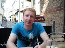
And we are now sat outside in the glorious sunshine sipping beers, waiting for our £30 lunch to settle and deciding where to visit.

Comments

Popular posts from this blog

The Open Source Teacher (… is born)

  Let’s keep this first post quick, a foot in the door and an introduction. The past year has been somewhat tumultuous and that was before even the dramatic events of the past year; I took a gamble with my career and it didn’t pay off, yet. Most people support the notion that the path to success is paved with failures; they lead us to learning key lessons and provided that we take something from each, we will make it there, some-when somehow. It’s not easy that’s for sure and the more you have in life, the greater the risks you face when you try to put yourself out there and try something new. This particularly project though is a personal one, an experiment if you please and a way to find a way to become part of the conversations that take place around certain subjects: Open Education, Technologically Enhanced Education and Open Source. I have always had an interest, but just never found the time to actually roll my sleeves up and get stuck in, until this year, for a couple of rea...

A Look at G+'s Photo Editing Features

From a business perspective it is very easy to explain why Google Plus is a great platform, an important element in on-line marketing strategies and search engine optimisation, particularly whilst Google's market share for search traffic stands around the 90% mark  (StatCounter, Jan 2014)  in the UK. Many are confused by the platform currently, and this is due to the precedents set by Facebook and Twitter for example, it isn't simply a page with lots of features and it doesn't really matter from a business perspective that only 300 Million Active Users visit a month  (Barr, Oct 2013) In addition, from a professional perspective it is an easy argument too; the articles and conversations are essentially focussed around more professional issues, therefore the content is largely relevant to a professional audience irrespective of discipline or industry. From a personal perspective, it is less-apparent to most, why the platform is valid or of interest. To counter though, ...

Google Says Bye Bye to Bevelled Look

The new logo on Google UK 'looks flatter' according to BBC News's Leo Kelion (2013); I have to admit I was unsure if this was an actual change or not, to start with and took a double take, but it appears to be on a slow roll-out, the changes to the interface are subtle but very focussed on removing distractions and streamlining both the page layout (if it could be any more streamlined) and the user experience. Clearly, there are larger changes afoot, but if they are as subtle as these most users perhaps will not notice so much. The logo itself does feel cleaner now that the bevel has been removed, but could this be argued too simplistic? Eddie Kessler of Google (2013) stated in their official blog that they have also updated the colour palette and the letter forms, but these are very subtle differences indeed; the relationship between the first 'G' and 'o' does seem still to be quite awkward, but as ever this logo is as much about the negative space as it ...